These originally appeared on the Instagram feed as single weekend posts. I wasn’t going to post them here, because doing so felt noisy. On Insta, they feel less like filler than they would here. But at the same time, I didn’t feel right leaving them out. So here they are, in a great big mega-post. I’ll probably do the same for the remaining weekend magazine posts for 2024, but don’t expect to see Dragon Magazine get the same treatment. Too many, too well-known, too much bother.

Different Worlds 1 (February/March, 1979) Kind of a grisly cover by Steve Swenston, but I really like it. Everything goes back to nature, eventually! Not super psyched about the white text over everything, but what can you do? Though this magazine was published initially by Chaosium, it remained pretty editorially independent.
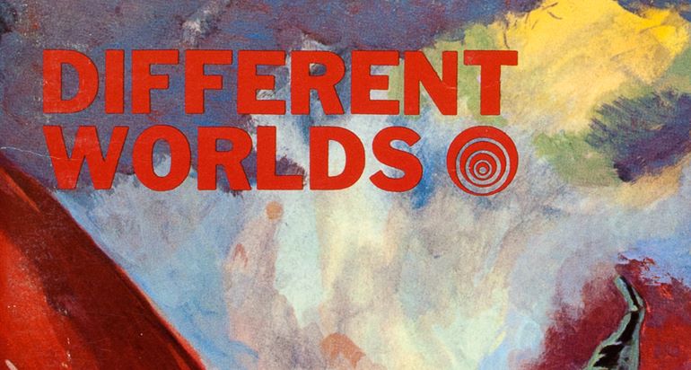
Different Worlds 2 (April/May, 1979) William Church and Steve Oliff serve up a nice if unremarkable cover. Not sure what the tag line “Magazine of Game Role-Playing” really means. Is it intended to differentiate from the practice of roleplaying is psychology? Was that a real point of confusion in ‘79? Still, this is still a pretty early usage of the term — “fantasy adventure game” and similar descriptors were still more common. Also, the tag line changes a lot over the magazine’s run and I find it pretty amusing.
Different Worlds 3 (June/July, 1979) Tom Clark on the cover. I like the surreal mix of science fantasy, ‘60s sci fi novel covers and like a proto-Warhammer aesthetic? Grim and strange. Strong contrast in both direction and quality compared to where Dragon Magazine was at in ‘79.
Different Worlds 4 (August/September, 1979) Jennell Jaquays cover, colored by Steve Oliff. A solid “possibilities of roleplaying” sort of collage, in her early cartoon style. Remember those alien mites on the left, you’re going to see something like them again in the summer…
Different Worlds 5 (October/November, 1979) Tom Clark again. Not as strong an effort as his previous cover. It seems unfinished. But I still like the atmosphere. I get a little bit of a Bakshi vibe.


Different Worlds 6 (December/January, 1980) Rick Becker on the cover, also giving me a Bakshi vibe, but in a different way. I feel like this sort of cartoony or comix fantasy was very much a thing in the late ‘70s and early ‘80s, but never really wound up in TSR (there are the comics and such in the 1e books, but those feel like a whole different thing) and consequently seems to have died out as a stylistic choice (maybe replaced by manga- and anime-influences?).
Different Worlds 7 (April/May, 1980) Skipped a publishing period, but declined to adjust the month to March/April, which I find vexing. C. L. Healy on the cover. Entirely unfamiliar with their work. I don’t quite know what to make of this one, and there is some weird Escher-esque warping of the perspective going on that I find unpleasant. Worth noting it is now a “Magazine of Adventure Role-Playing Games.”
Different Worlds 8 (June/July, 1980) Steve Oliff’s first solo effort on the cover. I like the composition a lot. That dude looks tired and that dragon looks like it died hard.
Different Worlds 9 (August/September, 1980) Luise Perenne, probably most famous for her RuneQuest box set cover, has a battle scene here, also probably drawn from RuneQuest. Crude, but still rather dynamic. It looks like she slammed the paint on there in a fury.


Different Worlds 10 (October/November, 1980) Rick Becker back again with a solid cover. I really like this pair; I feel like they leap directly out of a game session with a ton of character. The hand poses are a little weird, but the palette is real nice.
Different Worlds 11 (February/March, 1981) Another publication window skipped without correcting the months, argh. Jennell Jaquays on the cover again and I think her growing confidence is really apparent. Really like the designy background with the star field, very nicely early ‘80s without being over the top.
Different Worlds 12 (July, 1981) This issue marks the shift to monthly. William Church on the cover. The perspective doesn’t work the way I think it is maybe intended to work, but I like it anyway. For reasons I can’t explain, that boardwalk bridge reminds me of the path to Max’s house in Lost Boys.
Different Worlds 13 (August, 1981) A fine-for-the-time cover by Roland Brown, whose work I am unfamiliar with. Lot of nice details in the figures. I particularly like that Brown made the ice creature’s hand partially transparent.


Different Worlds 14 (September, 1981) Tom Phillips on the cover. Don’t know his work but this has the sort of smooth minimal look that was on a lot of fantasy covers in the early ‘80s. Something weird going on with her mask and nose and she, uh, looks like her mind is elsewhere. And the unicorn looks thoroughly annoyed, amazingly so. Worth noting, perhaps, that this and all the previous issues of Different Worlds were previously in Greg Stafford’s own collection. Makes ‘em that much more special to me.
Different Worlds 15 (October, 1981) Rick Becker back with a space dildo. I mean space ship. Also, a woman, a gun, and a robot. But mostly I see the space dildo.
Different Worlds 16 (November, 1981) Tom Clark changing up the mood with some fantasy violence. Dark, gritty, this one echoes his cover back on issue 3. The action isn’t quite as dynamic as it appears at first glance, but I really love the palette, the dark tones and that very Frazetta sky. Dig that blue guy’s mask, too.
Different Worlds 17 (December, 1981) Another atmospheric shift, this time by Steve Leialoha, another artist I am not familiar with. This cover is so bizarre I can’t help but love it. Froggie Paul Revere? Are the British coming? Or is the person leaning out the window a mage who just turned a thief into a toad? Mysteries upon mysteries. Gonna call it now: this is the weirdest Different Worlds cover.


Different Worlds 18 (January, 1982) The most science fiction cover we’ve seen in a while, by Kevin C. Ellis. I’m kind of a sucker for these sorts of space combat scenes, even though they tend to be a little static and boring (so, so many Space Gamer covers like this, to the point they all look basically the same). On the other hand, they almost always have interesting formal elements, unusual color schemes and lots of detail, like this one! Lot of Star Wars star destroyer inspiration here, I think.
Different Worlds 19 (February, 1982) The first Call of Cthulhu cover. We’re gonna see a lot of these, indicating that maybe Cthulhu on the cover of a book makes it more likely to sell in a way similar to a dragon. This is also the first issue with a lighter weight cover and glossy interior pages — before this, they really felt the same as a stapled Chaosium sourcebook.
The cover art is by Roland Brown. I am a sucker for just about any early Call of Cthulhu art. It’s often a marriage of weirdness and crudeness that I think works very well. This one seems crude at first glance, but I think it is actually very effectively impressionistic. Brown has very good control of light and the body language and the detailing of the couple is really fantastic. The tentacle monster is similarly well-rendered. This one gets better the longer you look at it!
Different Worlds 20 (March, 1982) A new entry by Luise Perenne, keyed to an article by her partner Steve Perrin inside. It’s cool seeing how rapidly she’s honed her skills compared to her last cover. This one isn’t really my bag, but it does a good job of evoking the idea of magic in motion.
Different Worlds 21 (June, 1982) A two-month break! Alan Burton on the cover. Absolutely adore this one. Great color scheme, great composition, very late ‘70s fantasy fan art vibe. There is something in this that reminds me of some of the stranger art in the David Day Tolkien books.


Different Worlds 22 (July, 1982) Lisa A. Free depicting a morokanth from RuneQuest/Glorantha. This is the first time that a clear bit of Chaosium’s owned intellectual property is on the cover. I like this one — the morokanth is covering a pit trap likely intended to capture a human. The autumnal color scheme is nice. I am surprised I don’t like it more, though — I usually LOVE Lisa A. Free’s stuff, but this one I merely like. Oh, also, it’s now “The Magazine for Adventure Role-Players.”
Different Worlds 23 (August, 1982) If you’ve ever desired a Bill Willingham group portrait of the 1982-era X-men, wish granted.
Different Worlds 24 (September, 1982) Brad W. Foster just airbrushing the heck out of some dwarves (I’m assuming that’s airbrush, but correct me if you think I’m wrong). I feel like the technique plus the color scheme makes this extremely of its moment.
Different Worlds 25 (November, 1982) The magazine has slipped into a bi-monthly schedule again. Cover is “Glaciers,” by Mark Roland. It’s quiet. I like it.


Different Worlds 26 (January, 1983) “Odin Regarding an Adversary,” by Luise Perenne.
Different Worlds 27 (March, 1983) “Dawn of the East,” by Mark Roland. This reminds me a lot of Dragon 31. The texture and palette here are too much for me, though I do like the way the city reminds me of the Palace of Fine Arts in San Francisco.
Different Worlds 28 (April, 1983) Monthly again, but for how long? “Jarnon of Zaffar,” by Gayle Hamilton. This cover is ridiculous and I love it. “Breast plate?” I’ll say. How come the codpiece with the down arrow doesn’t get a call out?
Different Worlds 29 (June, 1983) And back to bi-monthly. I suspect this was deeply frustrating for readers. The cover is “The World of Pandora,” by Alan Okamoto, a much quieter composition than the previous cover. Nice light, very subtle shadows. I like that the reviews of Star Frontiers and Return of the Jedi are set at an even level of importance.


Different Worlds 30 (September, 1983) A two-month gap — I feel like that at this point, the magazine was being published “intermittently.” The cover is another painting by Alan Okamoto, a rather striking group portrait of DC’s Teen Titans.
Different Worlds 31 (November, 1983) Steve Purcell’s first Different Worlds cover. A solid action scene. I noticed them AFTER I finished photographing the magazines, but this issue has some cool early Mike Mignola fantasy art — worth seeking out on your own. Consider it VRPG homework.
Different Worlds 32 (January/February, 1984) Officially back to bi-monthly, and on the right pair of months even. Love it. Brad W. Foster and his airbrush back again. This one almost has a Terry Gilliam/Monty Python look.
Different Worlds 33 (March/April, 1984) Steve Purcell again, with a very detailed post-apocalyptic view. There’s the duck mutant, for one, who is a lot to take in (and reminds me of the hospital staff in the “ugly” woman episode of the Twilight Zone). I dig the mutant’s sharpened bone and the toaster in the rubble. I also like how rakish and debonair our wastelanders are. Also, forever puzzled that “post-holocaust” was the parlance for “post-apocalypse” for so long.


Different Worlds 34 (May/June, 1984) The third superhero issue, which seems surprisingly frequent (the last was just five issues back!). I like the fact that this issue, after previous features on the X-Men and the Teen Titans, goes with DNAgents from Eclipse Comics, which is possibly the most ‘80s super hero comics decision. I just don’t like Will Meugniot’s composition here at all. It’s like, given too much space, he didn’t know what to do with it. The fact that it is a framed inset doesn’t help at all.
Different Worlds 35 (July/August, 1984) Man, I absolutely adore this cover. Back in ‘93, I went to NecronomiCon in Danvers and the handful of vendors tables had a feast of Call of Cthulhu and Lovecraft STUFF I had never laid eyes on before, never knew existed. Being 15, I had limited funds and used them to get one big cool thing (the Spawn of Azathoth box set, which Keith Herber then dutifully signed) and as many small things I could afford (a big old pile of third-party stuff like Lurking Fears and Pursuit to Kadath and so on — it’s funny how I can tell you pretty much everything I bought that weekend). This issue of Different Worlds was juuuuuust out of budget, and left behind mostly because it was a magazine not entirely dedicated to Call of Cthulhu. But that cover! It’s so good. It’s another banger by Steve Purcell, and the start of a run of four covers that is pretty amazing.
Different Worlds 36 (September/October, 1984) Love a sorcerer who is summoning. The second of a four-cover run by Steve Purcell, this one is full of fun details. I particularly like the bottled spirits and the taxidermied crocodile. The seal on the cauldron is for Zepar, though it is inverted (rather than get up and pull down my Goetia, I just looked this up “demon seals” on Google and found a Wikipedia list of all the seals and sometimes this modern world is delightful).
Different Worlds 37 (November/December, 1984) “Scramble!” by Steve Purcell, pictures a Kzin pilot hopping into their fighter. I’m not as wild about this painting as the previous two, but still pretty high-quality stuff. Worth noting that aside of the core box set and a companion book, this might be the only other support that the Ringworld RPG got.


Different Worlds 38 (January/February, 1985) “Robot Wars” is the last of Purcell’s four-cover run. I dig the flying pteranodon mech and, generally, this composition, even though mechs aren’t super my thing. This is Purcell’s last cover for the magazine and also the last issue published under Chaosium’s ownership.
Different Worlds 39 (May/June, 1985) Another gap in publication as editor Tadashi Ehara moved operations to San Francisco under Sleuth Publications. I can’t find a real explanation as to why the magazine went with Ehara — it was launched by him and Greg Stafford as a Chaosium product, but Ehara produced every issue, so maybe Stafford considered it his? Maybe he bought it! But that doesn’t seem to be the case — in the editor’s note, it seems like Sleuth took over publication, but it was Ehara’s decision to relocate. Anyway, the cover is “Insectoid Robots,” by Brad W. Foster. It seems to harken to an earlier period of the magazine’s design aesthetic. It is also “The Magazine for Adventurers” now.


Different Worlds 40 (July/August, 1985) This one is hilarious. Just take it in. A wrap proclaiming “New & Improved!” The still newish tagline “The Magazine for Adventurers.” A mostly hidden cover painting that features a man with no shirt on. Yea, I know it also says “Adventuring in the World of H. P. Lovecraft,” but I think it’s funny that the whole package gives the unintentional impression that Different Worlds has turned into a skin mag. I think I was genuinely disappointed that, of all things, the cover is a riff on Harry Houdini and Lovecraft’s “Imprisoned with the Pharaohs,” by David Dixon.


Different Worlds 41 (January/February, 1986) Another fitful period for the magazine, skipping two publication windows. A strong return with a Frank Frazetta cover (“Charging Huns”) and a feature package on his new book and the founding of his museum. I bet that sold some copies! Also, it’s now “Games, Role-Playing & Adventure.”
Different Worlds 42 (May/June, 1986) Another skipped publication date. The cover is “Alien Bandits,” by James Warhola, and is accompanied by a feature on his career. This one is fun, with a background city that looks almost Seussian. I also like the sense of warm comradery I get from my muggers, here — I may be poorer for the encounter, but at least I helped a group of friends strengthen their bond.
Different Worlds 43 (July/August, 1986) “Horn-blower,” by David Mattingly (no, not that one). Solid. New tagline, too, “Journal of Adventure Gaming.”
Different Worlds 44 (November/December, 1986) “Magic for Sale,” by James Warhola. Absolutely love this one, how subtle it is, and how much there is to look at and pour over. I think part of my enthusiasm is down to how long it took me to see the painting’s quiet twist.


Different Worlds 45 (March/April, 1987) “Cthulhu,” by Brad W. Foster. A rather Krang-ish interpretation, but I like it. I find that Cthulhu is too-often depicted as a humanoid giant with an octopus stuck on his head, and I tend to like interpretations that pull away from that. This Cthulhu looks like he flows rather than walks, and I dig that.
Different Worlds 46 (May/June, 1987) “The Scout,” by Kevin C. Ellis is a return to the capital starship of Different Worlds 18, from a slightly different view and featuring a different fighter. This one works less well for me, I think partly because I’ve basically seen it already, and partly because the blue color scheme is rather clean of atmosphere
Different Worlds 47 (Fall, 1987) This is the first issue of the magazine published by Tadashi Ehara’s own company, Different Worlds Publications. It is also the final issue of Different Worlds, alas. Around the same time he parted ways with Sleuth, Ehara published several Tekumel supplements and purchased the dead stock of several companies, including my beloved Gamelords, with the intention of resurrecting their lines. Those plans never bore fruit and Ehara soon left the world of tabletop games for a career in tech (though the DWP site was still selling dead stock as recently as the ‘00s!). The cover for the final issue is “Road Hazard,” by Mike Lane. I like the basic concept (which feels like it could have inspired the Call of Cthulhu scenario Dead Lights) but I think the execution was lukewarm. Anyway, RIP Different Worlds, you were pretty great while you lasted.